While we were tasked to work as a team for the majority of our work, we all decided that the work would go smoothly if we split certain areas into individual solo work. My contributions were as follows;
Video Advert:
When we were told that we would have the opportunity to put together a visual-audio advert, it seemed natural that I would take on the role as writer/director.
My first task was to write a short one-page screenplay for our 30-45 seconds advert. This was not a too difficult task as I had previously written screenplays for short films, college work and future projects. I made sure to write it in a typical screenplay structure that got across all the necessary information that was needed to be known, leaving out details that we could sort out during location scouting, prop design and direction.
After writing the script, I moved immediately on to the film’s storyboard – with some basic sketching and a considerable knowledge on shot direction, I was able to make a basic mock-up of how the final product would play out.
We then did some location scouting and the next day went immediately into shoot, with myself as director, Tyler Peart as my cinematographer and camera operator, Logan Watts as assistant director and boom mic operator and Maider Uranaga as the character for the audience to focus on and connect with.
After finishing principal photography, post-production began almost immediately, with Tyler providing the overall editing and myself giving the some final touches and colour corrections for the finished cut:
https://www.youtube.com/watch?v=jzN0WkvnDxk&feature=emb_title
Audio Advert:
Just like the video advert, I wrote the script for the audio advert for an immediate recording session. With Logan in mind for the narrator for both the audio and later visual advert, I set out to write a script that would express the feelings we had as a group towards the dangers of Climate Change.
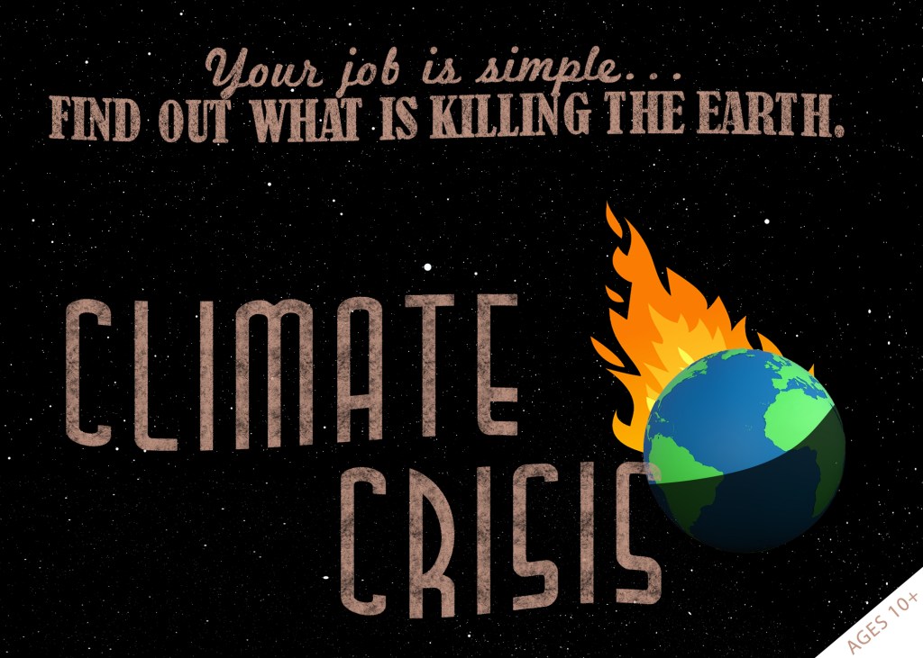
Product Emblem:
I tasked myself with creating a company emblem that would represent the message of the board game. I made sure to use minimalist imagery to allow audiences to make their our decisions about what it means – a picture of the planet earth entrenched in fiery embers:
Poster:
After finishing the emblem, I used it in our final version of the promotional poster. Using PhotoShop, I surrounded the idea around the imagery of the fiery earth. Stars, taglines and a title, coupled together with a matching font design made for a great poster that is stylistic as well as being practical.